Brand kit
Cannabis 4 U identity
Modern apothecary: deep forest greens, warm cream paper, brass detailing and a serif voice. Trustworthy and adult — closer to a dispensary's better shelf than to a head shop.
The mark
A seven-leaflet cannabis leaf inside an apothecary seal. It works down to a 16px favicon and up to signage. Brass on forest is the primary pairing; never place the brass mark on a light ground without the forest seal behind it.


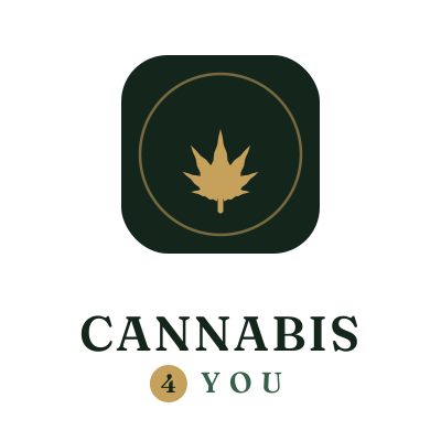
Files: logo.svg (horizontal lockup) ·
mark.svg (seal) ·
logo-stacked.svg · favicon.svg
The wordmark is outlined, so the files render identically without Fraunces installed.

Palette
Forest and ink carry the brand. Brass is an accent — used for one thing per screen, never as a background for body text. Clay signals warnings and closed states only.
Typography
Voice
We sound like
Plain, specific, unhurried. We give numbers where numbers help. We say "start with 2.5 mg", not "start low and enjoy the journey".
We never sound like
Stoner in-jokes, wellness mysticism, medical claims, or hype about potency. No "fire", no "medicine", no promises about what a product will do for anyone.
Non-negotiables
- Every page is 21+ and says so.
- We never imply we sell, deliver, or broker cannabis.
- Search order is distance. Placement is never sold.
- Education carries a disclaimer; nothing reads as medical advice.